Since after researching different types of Anxiety disorders and the effects it has on individuals and the mind. It has given me a clearer plan of how many pictures can be done for the photo set and which photographs can represent each disorder.
These disorders are that of
Generalized Anxiety disorder
Social Anxiety disorder
Post-Traumatic stress disorder
Body Dysmorphic disorder
Agoraphobia
Depression
The series will be representations of different phases of the disorders either by the start of the Anxiety, the triggers and also the conclusions or dangers. Such as how depression is a high outcome of the condition and how it ultimately effects the individual. The props will also be involved by their meanings and how they relate to causes of the disorders in different ways.
Anxiety - Social Anxiety Disorder
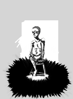
To start off with one of these Anxieties I have did media experiments with one of the storyboards which represents that of Social Anxiety disorder. The name speaks for it self but it is basically someone who suffers with anxiety in social and public situations. Which causes them to have negative symptoms in crowed environments and social connections.
I have taken the storyboard image I did for this and experimented with different digital media in Photoshop with it.
Meaning Behind the image
I wanted to be expressive with these images and use different textures and shadows to help me visualize better what I wanted in the Photo shoot. The initial idea for the image was to have black ink/paint in streaks around the model from the chair they are sitting on. It was to emphasize the negative energy coming from the person and how the chair makes them a more central point. The body language is also supposed to be quite tense and awkward with the legs closed and the arms crossing over the body. The shadows are supposed to emphasize this further as well as the black fabric.
As for it being in a social situation I wanted it to represent it as someone being in a place such as a bar or a party. Since the chair is a type of high chair and the model is holding a drink in their hand but they seem disinterested in it. That their body language isn't very positive to be in a situation that would be in a place such as a party or bar.
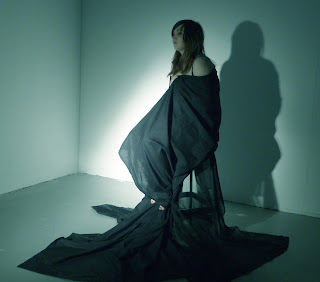
To further this I arranged a studio and a model who is the lovely Charlie and assistance from the amazing Maddie to test out this image. I also had a lighting tutorial in the morning before the photo shoot which I found very helpful in terms of atmosphere, mood, tone and being expressive with lighting.
Equipment and Tests
Blonde lights were booked out for this shoot which are incredibly powerful and bright lights and they tend to get hot very quickly. They have a yellow hue to their light source which is why they have the name Blondes. Also a camera tripod to help keep things steady and I needed the practice its been a long time since I have used a photographic tripod.
Testing out some of the lighting before we began shooting and before Charlie got ready.
We first tried out some simple shots with the lighting and fabric and negative expression.
Digital edit test with a blue hue to emphasize a experiment with color and mood.
Some close up tests of the face and expressions.
We also tried moving the camera and tripod around as well as the lighting and the slight changes made different contrasts to the moods and expressions. Which has taught me that the simple changes and movements can really change a meaning or image in huge ways and I felt positive about it once in practice.
I did like the tones of these images and their was blue and white skrim used over the light and I found I enjoyed the subtle more lighting than to the blondes. This has made me want to use the other lights for the future shoots since they will suite my themes better.
The reason I added the disco light ball was because I wanted something to represent a vibrant social theme in a non complicated way. This is a simple way of seeing what other props are like introduced to the photograph. As well as I wanted to play with other light sources and I found that this light source needs to be in a smaller and darker environment to be used more effectively.
I also felt that once I moved the fabric to sit on Charlie's shoulders it made her look more authoritative and less vulnerable from the image I wanted to show. This was another lesson I learnt about how simple changes can portray different meanings effectively and will be something I must be aware of during sessions.
Since practicing with photo shop again on my own for this project I was playing around with different filters and effects. I tried to be more expressive and ended up playing around the image option of threshold. I cant help but think that Charlie's shadow looks like its grabbing or trapping her in this image and felt it was really strong and expressive. This may be another way I plan to use in the photographs to see the different moods and effects I can get.
I found that while doing the shoot it was a lot more tricky and difficult to get shots I wanted and how I wanted them. Charlie is a great model and she was great to photograph but I feel I need to learn more and practice more before I can get what I want to portray. I found my self being to disorganized in how I wanted to direct Charlie and setting up the scene. This has taught me to plan out the next one much better and have more resources. Also that I know how lighting works a lot better and which ones will work out better to get the mood I want.
I have learnt a lot by doing this one session and feel more confidant and positive to get into the studio again and start shooting more. I have had more interest in models for the photo shoots so I will be working on getting them organised. As well as working further on the storyboards, sketchbooks, development, prop gathering and learning more about the equipment.
Onwards to the next shoot!


No comments:
Post a Comment